Thursday, December 11, 2008

Final Project


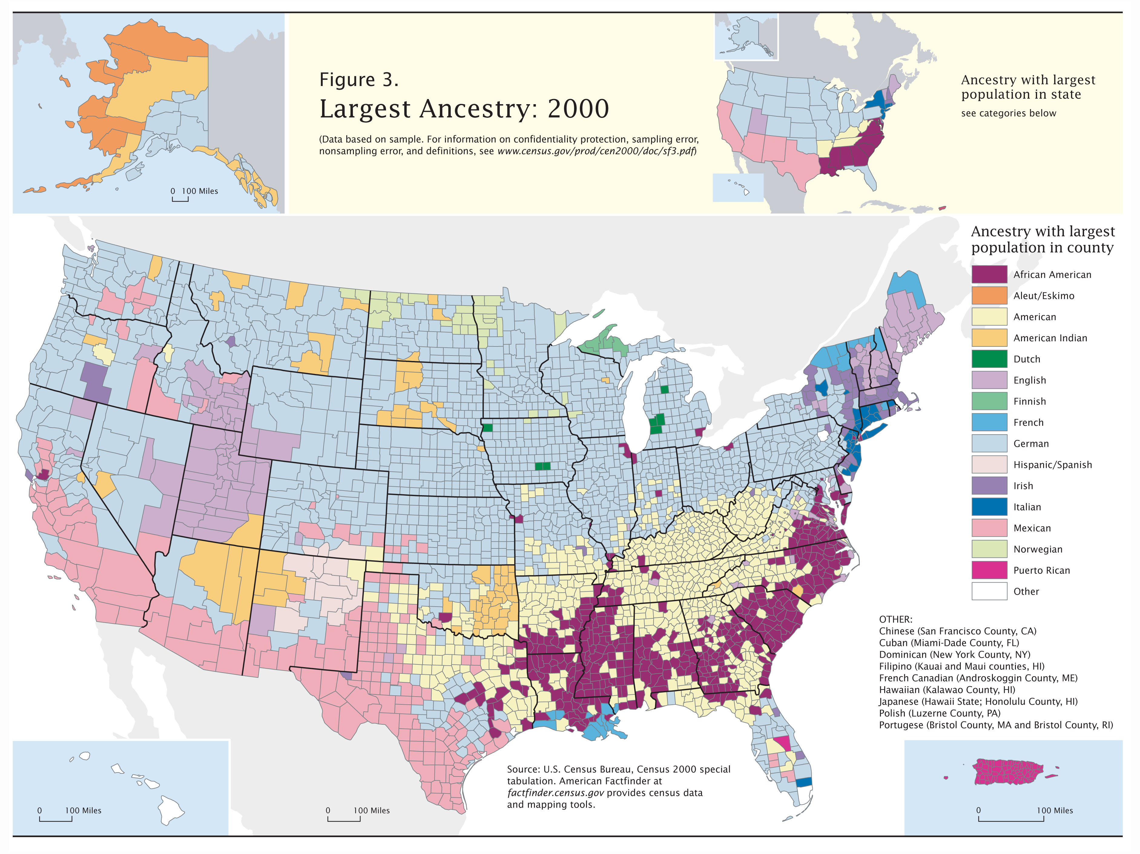
This is the best map I could produce to depict the ancestral stock of "white Americans". There is a lot of data on this subject from the census.

-- I got all the data behind these maps from the Census 1980 Ancestry report. [1980 was the first year that "What is this person's ancestry?" was asked].

-- Here are some simple choropleth maps of distributions of ancestry groups in the USA. And a map of the most-numerous ancestry-group reported for each county. I'm sure most people have seen these or similar maps at some point...my goal was sort of to convey the information in all those maps in a single map.

-- The best/only(?) way to convey overall-ancestry by state in a single map was the "mean center" map I created. This was tricky to figure out in ArcMap and was a big timesink in general, but I'm happy with it. Basically the concept is that a spatial average is calculated for all the country-of-ancestry centroids, but all the dots are weighted [given more "pull"] by the population I assigned them (which I took from the 1980 census). Here is an image of a more well-known application of the mean-center technique...

-- Here is an image of the file I created of all the centroids of various population groups, which was step one in creating the state dots. (Most are centroids for countries, but some I assigned based on outside knowledge, e.g. the Basque dot sitting in the north of Spain... And yes, I included Arab countries and Iran, since the U.S. Census apparently classifies them as white.)

Other comments: Most people who have been in the USA for multiple generations have more than one country of ancestral origin. But most people only gave one response was given to the ancestry question on the census form. Hopefully it all more-or-less evened out, since the numbers being dealt with here are so large (200 million people). The census allowed multiple reporting, and lots of people reported several. In compiling the data I weighted a multiple response as 0.5 and a single response as 1.0...
Some would criticize the idea that the mean-center map is valid in this case, because, for example, the number of people of French in Hawaii is probably very low: Yet the mean-center for Hawaii is in France. I think those criticisms are not valid, because if someone understands the concept they will rightly see this map as relative, and broad patterns can be seen (especially compared to the "USA" dot).
1. North Dakota is the most Scandinavian state, followed by Minnesota.
2. Rhode Island's mean-center is furthest south (apparently because of the large number of Portuguese who settled there), followed by New Mexico (a large share of Spanish). New York and New Jersey are also far south from their large number of Italians. Hawaii is pretty far south, I wasn't expecting that. It looks like a lot more Portuguese went there than I would expect.
3. California is exactly average except has a larger pull southward, obviously from white Hispanics but also from numerous other immigrant groups, like Armenians, Iranians, and so on.
(One other thing of interest is the lack of many people at all willing to claim "Belgian" ancestry. This is because there are no Belgians, only a few million southern Dutch and a few million French who share a state, for some bizarre historical reason.)

Thursday, November 20, 2008

Two-Variable Choropleth (Lab 10)


Since double-variable choropleths are very hard to understand, my goal was to create a very straightforward one. This was a big conceptual/design challenge. The main thing I did was drop any mention of numbers in the legend and instead used "low/high", based on standard deviations away from the mean.

Basically I created a hypothesis to "test", which is that the lowest-density county will have the lowest crime rate and the highest-density will have the highest crime rate ("urbanization causes a rise in crime rates"). After doing the math, I plotted the points in excel and saw that a fair number of counties were way outside this basic regression line. This very simple "model" doesn't predict urbanized counties well (I added dots to show the major cities, Charlotte, Raleigh-Durham, etc.) to show this to the viewer.

[One problem is that the dark-green counties don't have "low" crime rates- They have crimes rates much lower than *predicted* If density is 6 standard deviations above average, and crime is "only" 3 above average [which is still high in absolute numbers], the county is dark green). I'm not sure how to show this in a very simple manner.]

I probably made this needlessly hard, and wound up doing a lot of math/statistics to derive this map. I'm still not sure how logical it all is to the viewer.

Wednesday, November 12, 2008

My choropleth map in color (Lab 9)


Lab 9 was to remake our choropleth map to include color. I was able to take advantage of this because my data has a "qualitiative" division as well as the quantitiative. Some states never had any Basque settlement, whereas others did (mainly southeastern Idaho and northern Nevada and radiating out from there). Red=No "appreciable" Basque settlement, Green=Yes "appreciable" Basque settlement. So, I colored all states reporting "under 0.01%" in red. For the states that did receive Basque immigration, I used a green color ramp to show how concentrated they were by state. Conveniently, red and green are also the colors of the Basque flag, which I blew up from the previous version. I made various other minor improvements including stealing somebody's Basque-flag clipart. (I also learned that the Nebraska result was a census filing error in 1980, or something like that, giving it several thousand Basques when the state really has almost none; Nebraska should be in red in reality).

I printed a color copy using the lab printer, and it looks pretty different from what I am seeing on the screen. The colors are much brighter/stronger on the printed copy, I suppose because the screens in here are very bright, making the colors look lighter than what they "really are". On paper, the red appears much darker than I wanted it to be. I would definitely find a lighter red if I could get a second shot, because I want to emphasize the green-scale, and not the red. (I wanted to say that the red states are so unimportant to the subject being mapped that they are "off the [green] scale".) Maybe I should have just kept everything on a green scale and made the eastern states a very-light green...

Monday, November 10, 2008

Lab 8: Proportional Symbol Map


Drawing the cow was by far the hardest part.

American vs German World War I maps

Being that tomorrow's class is November 11th, WWI Armistice Day, I found two maps appropriate for that occasion. These two maps show how color can-be/is used in map-making.

Each map presents the same information, the alliances in Europe during World War One. The only difference is the choice of color-- Each nationality/language shows their own side in green and the other side in red.

(WWI was probably the stupidest, most pointless war ever fought in Europe, so if I were to make the map I'd put every belligerent in whatever color best signifies stupidity and green for countries smart enough to stay neutral.)

English-language Map of WWI belligerents (American source)


German-language map of WWI belligerents (German source)

Thursday, October 30, 2008

Lab 7: Choropleth Map

I mapped Basque-ancestry by state from 1980. Natural Breaks looks great, Quantiles looks terrible.


Cloropleth map of Canadian fatness

This is an choropleth map of obesity in Canada. I think it uses a standard deviation scheme, which allows it to name its categories "significantly higher/lower" [one standard deviation above/below?] than mean.

The healthiest parts of Canada seem to be Quebec and the west-coast. Inland is fatter.


Full image : Click here.

Wednesday, October 22, 2008

Lab 6: Dot Density


I used some outside sources as references to help complete this lab, including this, this, and this. The last one was especially helpful because it listed the actual number of pre-1939 houses by city, which [after doing some simple math] used to figure out how many dots I should cluster around that one city. This is a lot better method than wild guessing. The other sources two helped greatly in placing the non-city dots.

The basic problem was "How many dots should I use"/"How big should they be"...Since most parts of the state are sparsely populated, having them too-few/small would leave out a lot of detail. Having too many/big creates unintentional "megalopolises", maybe engulfing the whole county from one city. I'm happy with my final product because I think I mostly avoided that problem. [Except maybe at Wheeling (which is in the third county down in the northern panhandle).]

Wednesday, October 15, 2008

Murders Map for 2008 D.C. Metro Area


[Click to view the whole map].

A map plotting Murders in the year 2008 in the Washington area.
I think this is a good example of a well-done density map.* It conveys its information effectively. The story behind it is that somebody has been scouring police reports from local counties/cities, plotting them spatially at their reported street location, and including some minor info in each case (name, date, address of incident, cause of death). This is only 2008 data, but the guy has also done past years, mapped elsewhere on his site.

Here is the 2008 plotted data: http://www.burgersub.org/murders2k8.htm.

Each little flag is the instance of a single murder so far in 2008. It is not surprising to anyone with basic knowledge about this area that they mostly occur in the eastern part of the District of Columbia and into P.G. county. The only other places that any have occurred at all this year are scattered cities (like Manassas) with many immigrants and gang activity. GMU is in a safe part of Fairfax County: There has only been a single murder around here in 2008. Just a mile or so north of the GMU campus, some poor sucker named "Adulio Bonilla-Morales, 36; stabbed [to death] on 8/16/08". A little north of there, some other guy is listed as having been "shot by Fairfax County Police" at his house (that's the blue flag).

I am fascinated by this map.


* - (They aren't technically "dots", but in effect they are-- They plot single locations of single events. Which is actually more precise than most dot-density maps, I suppose, which are generalized).

Virginia, Maryland, Washington Map (Lab 5)


There were several challenging parts to this lab: One- We had to make a scale "from scratch", Two- We had to deal with labeling features that have the same value (MD, VA, DC) yet are much larger or smaller than each other, Three- Various visual features were hard to balance (the background gradient, the thickness of the county vs state lines, figure-ground issues).

My solutions to the problems (in order), were,
-- 1. I measured the distance of Virginia's southern border in ArcMap, I measured the same on my printed map, and then using simple mathematics I calculated what the scale would be for my printed map. I then did a little more math to find how many inches 50 miles would be (just over an inch), and made the scale bar using the line tool in Illustrator. [I made the scale bar in part because it maintains its accuracy even when blown up or shrunk...I am almost certain that the 1 inch=48 miles verbal scale is wrong on the image.]
-- 2a. At first my solution to the "labelling Washington" problem was to point a line out eastward from Washington, and connect it to a box with the words "Washington, DC" inside it. I abandoned this idea because I thought it looked bad, and instead decided to create an inset around the immediate Washington Metro Area, so that I could actually label the city of Washington on the map. To do this I had to use the clipping mask tool.
-- 2b. I decided against labelling "Virginia" much bigger just to fill up the state, and instead made it the same size as the "Maryland" label. I figured that visual balance is more important than taking up all the space, a 40-pt Virginia label vs a 24-pt Maryland would look terrible. (One other strange thing is that my eye sees the Maryland label as bigger than the Virginia label even though checking and rechecking keeps telling me they are both 24-pt...)
-- 3. At first I had a gradient radiating out from a single corner, but this left a lot of white space. I decided to create four separate gradients coming from each corner. I also made the counties dark grey for contrast purposes.

One other thing: he scale is correct on paper

Wednesday, October 1, 2008

Lab 4 : Copying labels for Harper's Ferry

I had a paper version of the original map of Harper's Ferry, WV and a blank AI file of the same (with all the labels removed). The goal was to copy the paper-map's labels exactly, "by hand". Here is a small version of my attempt.


I think it turned out well. The hardest thing is drawing precise lines; the second hardest thing is guessing the font-sizes on the piece of paper vs the screen.

...

Here is a much larger version that I exported (click to view the larger version):

Wednesday, September 24, 2008

Map with interesting Fonts


Here is an interesting map that I found. Click to enlarge.

it is of North America, drawn in 1640. (based on what was "known" at the time). Canada is called "New France", it being a French possession at the time and till 1763. They included a huge amount of information in this map and used different fonts to portray qualitative differences in what was being identified.

Lab 3


This is my finished Mollweide graticule.

Wednesday, September 17, 2008

Graphic for Lab 2


My final product for Lab2. (It took my five tries at uploading to successfully get it.) You can click to make it bigger, but it's not very interesting.

Wednesday, September 10, 2008

My links

My five links are to :